I got all of my main filming for my main film done in a day, but I cut it all together and it didn't seem right, so I reshot the end of "A Working Student" and I now have a rough cut and an alternate ending, I feel the new ending for "A Working Student" is much stronger because it leaves the audience the figure something out for themselves, whereas before Amy spoon fed the audience the whole storyline but the new ending allows them to work it out for themselves.
I edited "A Working Student" using Adobe Premiere Pro, and this also took me all together about a day to do, and finish, I think it is very effective as it allows you to edit and cut down every scene, and combine the good bits from different scenes and make them flow. I think Adobe Premiere Pro is very effective editing software, and has made my short film of a higher standard than last year.
Tuesday, 13 March 2012


Character Profile

Name: Amy Ellis
Age: 18
Occupation: Full time University Student,
and Part Time Maintenance worker.
Amy is a High Maintenance, Maintenance worker. She is very intelligent and studies Law at university, she has lectures and catches up with work all day, whilst working all night to pay for her accomodation, books, and general living expenses. Her relationships with friends are deteriorating as she has little time for herself, let alone anybody else. She is struggling to get by, but it making ends meat, she sees her Law degree as the light at the end of the tunnel.
Why is Amy right for the part?
I asked Amy to play the part in "A Working Student" because she is a very charismatic person, she has a massive personality and is very passionate. She has a very clear voice and achieved an A in GCSE Drama. Whilst we were filming I told her to speak as if she was having a debate with the camera and she was really delivering the performance which I had in my mind. I don't think my piece would have been so strong if I hadn't have had such a strong actress.
Costumes..
Costume is a really important element of Mise en scene, which means everything in the frame. Costume makes the character more believable, if I had Amy dressed as a banana, it would be difficult for anyone to take her seriously as a character therefore she is dressed casually to make her character more believable and effective.
Main Costume-
 Casual clothing, which are things that a student would wear, I didn't want her to be too casually dressed so you could see a contrast between the clothes she usually wears and the clothes she wears at work, which is another reason why she finds it so degrading. I showed this costume to one of my audiences and they said it was a good leading costume, especially the tights, as red is a colour that people associate with promiscuity, and someone described the tights as "Whoreish, yet classy" which is good, because that's the image I am going for.
Jacket
 This is the jacket Amy wears when shes litter picking, it is dark outside so it does look like she is wearing a uniform, we were going to use a pair of overalls, but they were a very dark colour and you couldn't really see her outside, the jacket is quite sheeny so you can see it well and she still does look like a litter picker! It is also more realistic that she is wearing a jacket as it is cold outside!
Props
Laptop
 Was really important to show Amy doing her University work.
 This was a suprisingly useful prop, as it allowed me to take continuous shots, of Amy moving from the desk to the mirror.
 The books were a useful prop, for when Amy was talking about the price of her books, I made sure that I picked out books which said Law on them, which is what Amy is studying. They are definitely a necessary prop as a university student would have books all over the place.
  The mirror was one of the best props I used because it was good to use so I could get some shots from a different perspective.
 Was really important to show Amy doing her University work.
 Swivvel Chair
 This was a suprisingly useful prop, as it allowed me to take continuous shots, of Amy moving from the desk to the mirror.
Books
The books were a useful prop, for when Amy was talking about the price of her books, I made sure that I picked out books which said Law on them, which is what Amy is studying. They are definitely a necessary prop as a university student would have books all over the place. Mirror
 The mirror was one of the best props I used because it was good to use so I could get some shots from a different perspective.
 Use of Sound and Camera Angles
All of the sound in "A Working Student" is diegetic, she speaks directly to the audience as she wants people to feel sorry for her, and understand why she is doing what she is doing, not because she wants to but because she needs to, for the money. I felt that having Amy speak directly to the audience it would engage them more, as in a Short Film you do not have time to build an audience-character relationship, therefore I broke the imaginary "Fourth Wall" between Amy and the audience so she could directly appeal to them.
I used a variety of shots and camera angles whilst filming "A Working Student", shots were very important as I had to be able to see Amy's face all the time so we could see her speaking and her expressions.
Over Shoulder Shot- (0.14s)
 Shows that Amy is doing work, this is in the opening sequence, so we know shes doing work, giving us a clue that shes a student.
Mirror Shot- (0.26s)
 This is effective because it shows us that Amy is doing her make-up for work, it shows us what she is doing from another point of view, so we arent always staring straight at her, and it is like she is living her life as usual and not on being filmed.
Exreme Close up- (0.29s)
 Shows us another angle of her doing her make up, mainly for effect, as if the camera is her mirror.
 This is the first piece of dialogue, I have used a Close up shot to show Amy talking directly to her audience, as she is the only person in the film, she has to direct what she's saying at someone or we would think she is mad! Also, with a close up we can see all of her facial expressions and she can fully get across what she is saying.
Middle Shot-(1.08s)
 I have brought the camera back a fair bit so you can see the books she is holding up and so she can fully illustrate her point. If I hadn't have moved the camera back, we wouldn't have been able to see what was in her hands and then wouldn't have known what she was talking about.
Above Shot- (1.24s)
 This shot shows the camera looking down on Amy, I did this on purpose, it is a metaphor for how people would look down on her if they knew what she was doing.
Over Shoulder Shot (2.30s)
 So you can see the time, and you know she is going to be late for work.
Long Shot- (3.04s)
 As she is walking away, after we realise her actual job, this shot shows her leaving the scene and she is walking away from the audience, because she doesn't want anyone to see what she does for a living, she is ashamed, and doesn't want people to see her.
I used a variety of shots and camera angles whilst filming "A Working Student", shots were very important as I had to be able to see Amy's face all the time so we could see her speaking and her expressions.
Over Shoulder Shot- (0.14s)

Mirror Shot- (0.26s)
 This is effective because it shows us that Amy is doing her make-up for work, it shows us what she is doing from another point of view, so we arent always staring straight at her, and it is like she is living her life as usual and not on being filmed.
 Exreme Close up- (0.29s)
 Shows us another angle of her doing her make up, mainly for effect, as if the camera is her mirror.
Close up- (0.34s)

Middle Shot-(1.08s)
 I have brought the camera back a fair bit so you can see the books she is holding up and so she can fully illustrate her point. If I hadn't have moved the camera back, we wouldn't have been able to see what was in her hands and then wouldn't have known what she was talking about.
Above Shot- (1.24s)

Over Shoulder Shot (2.30s)
 So you can see the time, and you know she is going to be late for work.
Long Shot- (3.04s)


Poster Picture!

I used this image for my poster as I think it is very powerful, I took this photo a while ago, before filming, I created the effect of the white background by putting a bedsheet up on the wall (with great difficulty!)
She is looking down to show that she is ashamed, and I think this adds a great effect because she really is ashamed, I got Amy to wear this outfit because it is very leading, it makes us think that she is actually a prostitute, and this is what I want my audience to think initially before they see my film, so they are suprised at the twist in the ending.
It is important to use a powerful and striking image for your poster because you want it to catch the attention of the audience, and make them wonder what your film is about, it is also very important that the image you use is relevant to the film itself, otherwise you are misleading an audience, and attracting the wrong audience, and they will not enjoy your film, leading to poor reviews!
Choosing the right image for my review..

Choosing the right image for a review is really important as it gives somebody who is interested in it a small insight into the film itself, and as in my short film, I want people to believe that she is a prostitute, this is a good image to illustrate that, as it looks like she cannot bring herself to look at the camera, as she is ashamed.
In my review I will give a brief synopsis of "A Working Student", but obviously I won't reveal the ending, this image opens lots of doors.
Who reads reviews?

There is definitely a large audience for film reviews as there are several film review magazines and websites.
Does a bad review ruin a film's chances?
Everyone has different taste in films, what some people think is awful some people will really enjoy. Everyone interprets film in a different way, some people see watching a film as a good way to kill 2 hours, some people will see watching a film as a whole afternoon, or a hobby, even a career. Usually people who write film reviews are passionate about film and have an open mind, although you do read reviews which are always pessimistic, from narrow minded reviewers who are near impossible to impress.
It also depends where you read a review as to whether it will benefit or ruin the reputation of a film, for example if a film is written up as rubbish in “The Times” a broadsheet newspaper with a very high reputation, it would be likely that you would take it seriously as it is a bestselling News Paper.

Magazines like Empire and Sight & Sound take 2 very different approaches in writing up films. Sight & Sound is more likely to be a more genuine review of the film itself as they are government funded so they are more likely to be honest about what they think; whereas Empire are going to make it sound as good as they can and advertise it with a massive double page spread. Sight & Sounds articles are more modestly sized and are based around whether the film is a good watch, with a short synopsis.
Films aren't just reviewed in specialist magazines, they are also reviewed in magazines such as Heat and Zoo. Heat is a well known girly magazine and would be likely to review chick flicks, really well, whereas Zoo is Heat's Male equivilant, and would review any Boy typical Action/ superhero movie well!
 Having said this, a film reviewers are always more likely to have higher standards and expectations, and as a viewer you may not, and if you aren't interested in full scale reviews of films giving full details of the ins and outs, you may just be more interested in hearing what other people have to say about the film, Flixters Rotten Tomatoes, is an online film forum where people can say whether they think a film is a "Rotten Tomato" or not, this is a less serious approach to film reviewing!
Films aren't just reviewed in specialist magazines, they are also reviewed in magazines such as Heat and Zoo. Heat is a well known girly magazine and would be likely to review chick flicks, really well, whereas Zoo is Heat's Male equivilant, and would review any Boy typical Action/ superhero movie well!
Having said this, a film reviewers are always more likely to have higher standards and expectations, and as a viewer you may not, and if you aren't interested in full scale reviews of films giving full details of the ins and outs, you may just be more interested in hearing what other people have to say about the film, Flixters Rotten Tomatoes, is an online film forum where people can say whether they think a film is a "Rotten Tomato" or not, this is a less serious approach to film reviewing! I think although a film review may influence whether you would like to go and see a film or not, you still have to take taste into account, and people are always going to want to see for themselves and make up their own mind, I for one know that I have been to the cinema plenty of times and really enjoyed something and my friends have thought it was rubbish, or visa versa! Unless there was a mass hatred for a film and every single review for it was poor and telling you not to bother I don't think it would make an overall difference whether some people don't enjoy it or not.
Successful Poster Campaigns..
Some poster campaigns have become more famous than the films themselves, for example, the "Superman: The Movie" poster, Superman the movie was released in 1978, but the superman symbol is still seen everywhere, this is an example of a very successful poster campaign, the well known Superman symbol is still making money over 30 years after the film was released, you will see it on clothing, bedroom posters, and costumes.


This is why it is very important to take your poster seriously and make sure it relates to your film, because it could become an iconic brand like the Superman label.

This is why it is very important to take your poster seriously and make sure it relates to your film, because it could become an iconic brand like the Superman label.
Influences on "A Working Student"
 I always liked the idea of having Amy talk straight to the camera, I got the idea for this from some of the first ever "Sex and The City" episodes where the main character "Carrie Bradshaw" speaks straight into the camera about whats going on, breaking the fourth wall, I think this makes everything a bit more personal. She is also very comical and it makes it very enjoyable, I think they only did it in the first episodes so they could portray the characters across in the way they wanted to, and so they could allow their characters to connect with the audience.
 I also got the idea for the storyline of "A Working Student" from "The Secret Diaries of A Call Girl" The main character, has 2 identities, The first, Hannah, an average London girl, the second being Belle, who is an escort. I really like the way that Hannah speaks straight to the camera in this also, breaking the fourth wall, the way she speaks confidently tells us her story is interesting and comical, in "A Working Student" I have used a lot of these techniques, yet chosen to make it a bit more interesting, unlike Hannah/Belle, Amy is not open about her job, she keeps it to herself until the end when it is revealed that she isn't a prostitute like we are led to believe all the way through the film. I decided to do this as it is an interesting twist on the film and makes it comical and makes the audience think.
 http://www.youtube.com/watch?v=I8ThZGOKf6s
Common Conventions of a Film Poster

1) BOLD and STRIKING title.
2) Reviews and Star ratings, making people think it is good, and making them want to see it.
3) Main Actress (picture) and NAME in BOLD to draw attention to them.
4) Website, to make it seem more realistic.
5) Tagline, making you wonder, "Why is it innocent?".

I have highlighted the common conventions of a famous film poster and done the same on mine, to show how realistic I have tried to make mine, so that it looks like a real hit! I took all of these things into consideration when I designed the poster for "A Working Student".
Friday, 9 March 2012
The influence of film posters
Film posters have a big influence on films, because they sew the seed in your mind, if you see a poster which catches your eye with an actor or actress that you like then you are likely to look up the trailer or go and see it. Film companies use posters to name drop, they are most likely to put the most famous people in the film on the poster, even if they are not a main character in the film, an example of this is when "Batman, The Dark Knight" came out, Heath ledger died just before it was released, which caused a massive stir, and he, as "The Joker" featured on all of the posters to attract more people to see it, even though The Joker isn't the main character.


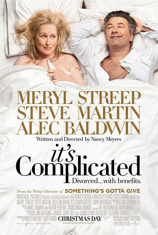 The film It's Complicated has a very large cast, but they haven't littered the poster with lots of pictures of the background actors and actresses, they have only put Meryl Streep and Alec Baldwin on the poster as they are the 2 most famous people in the film. They have also used a setting which gives away a bit of the storyline as well, which entices the audience to wonder whats going on and where the film is headed. This poster contains all of the common conventions that you would expect to see on a film poster: 1) Famous, well known actors on it, to make you think "Oh, I like Meryl Streep! Maybe I will go and see that!" 2) BOLD and LARGE names of the main characters that are and aren't on the poster to raise the question of the roles of them in the film "Oh Steve Martin, I like him, maybe I will go and see that!". 3) The title "It's Complicated" makes us question what the complicated relationship between Alec Baldwin, Meryl Streep and Steve Martin is, making the audience wonder and want to see it. The colours are also very light which combined with the expressions on their faces, it tells us that this is a light hearted film.

Batman The Dark Knight took $1,001,921,825 at the box office, Heath Ledger's timely death definitely generated some publicity for the film.
The Poster on the left definitely creates an eerie feel to it, and shows the relevance of the character, and shows only the hands and bloody smile of the character clearly, and "Why so serious?" this leaves a thought in our mind and creates a mood of uncertainty and tells us immediately that this is a scary film, and is designed to entice an audience that would enjoy this kind of film. This poster also tells us that The Joker on the poster is a massive character in the film, as the only reference it shows to Batman himself, is the Batman logo behind the title of the film. The title of the film is small in comparison to the size of the image on the poster, drawing our attention to the image more so, letting us make up our own mind about the film, the image is very powerful and allows us to drawer our own conclusions.
The poster on the right shows Batman, surrounded by images of The Joker on playing cards, this could be a metaphor that Batman is taking a gamble with The Joker. Batman has The Jokers bloody smile across his face, this is a very poignant image and is not something that you would walk past in the train station and not notice, it is very striking and designed to entice you and stay in your mind. It raises many questions, and is a very clever image.
These 2 posters are designed to draw your attention to them, and prompt you to be interested in the film, make you watch the trailer even and then make you want to see the film to tie up the loose ends that the poster leaves. These film posters do not contain any of the common conventions you would expect to see in a film poster, it doesn't name or actor drop, it allows you to make your own mind up. They both contain dark colours and images which tell us it is a dark film.
The film It's Complicated has a very large cast, but they haven't littered the poster with lots of pictures of the background actors and actresses, they have only put Meryl Streep and Alec Baldwin on the poster as they are the 2 most famous people in the film. They have also used a setting which gives away a bit of the storyline as well, which entices the audience to wonder whats going on and where the film is headed. This poster contains all of the common conventions that you would expect to see on a film poster: 1) Famous, well known actors on it, to make you think "Oh, I like Meryl Streep! Maybe I will go and see that!" 2) BOLD and LARGE names of the main characters that are and aren't on the poster to raise the question of the roles of them in the film "Oh Steve Martin, I like him, maybe I will go and see that!". 3) The title "It's Complicated" makes us question what the complicated relationship between Alec Baldwin, Meryl Streep and Steve Martin is, making the audience wonder and want to see it. The colours are also very light which combined with the expressions on their faces, it tells us that this is a light hearted film. These 3 posters are so different, not only are they different films they also attract their audience in completely different ways; although ultimatley the purpose of a film poster is to draw attention to the film and generate an interest in it, all of these posters do that!
Photoshop


 I used photoshop to create this image, this is my original poster, and then I had a change of actress. After I made it I decided that the background image of the cash wasn't very effective because it is old currency and also it portrays the idea that she has a lot of money and is surrounded by it when she isn't, so I took some images of copper coins to pose the idea that she is scraping money together.
 Photoshop was a really good tool to use to create the poster as I could use layers and I added a gausian blur to the backgroun d so Amy stood out more on the poster.
Subscribe to:
Posts (Atom)