

Batman The Dark Knight took $1,001,921,825 at the box office, Heath Ledger's timely death definitely generated some publicity for the film.
The Poster on the left definitely creates an eerie feel to it, and shows the relevance of the character, and shows only the hands and bloody smile of the character clearly, and "Why so serious?" this leaves a thought in our mind and creates a mood of uncertainty and tells us immediately that this is a scary film, and is designed to entice an audience that would enjoy this kind of film. This poster also tells us that The Joker on the poster is a massive character in the film, as the only reference it shows to Batman himself, is the Batman logo behind the title of the film. The title of the film is small in comparison to the size of the image on the poster, drawing our attention to the image more so, letting us make up our own mind about the film, the image is very powerful and allows us to drawer our own conclusions.
The poster on the right shows Batman, surrounded by images of The Joker on playing cards, this could be a metaphor that Batman is taking a gamble with The Joker. Batman has The Jokers bloody smile across his face, this is a very poignant image and is not something that you would walk past in the train station and not notice, it is very striking and designed to entice you and stay in your mind. It raises many questions, and is a very clever image.
These 2 posters are designed to draw your attention to them, and prompt you to be interested in the film, make you watch the trailer even and then make you want to see the film to tie up the loose ends that the poster leaves. These film posters do not contain any of the common conventions you would expect to see in a film poster, it doesn't name or actor drop, it allows you to make your own mind up. They both contain dark colours and images which tell us it is a dark film.
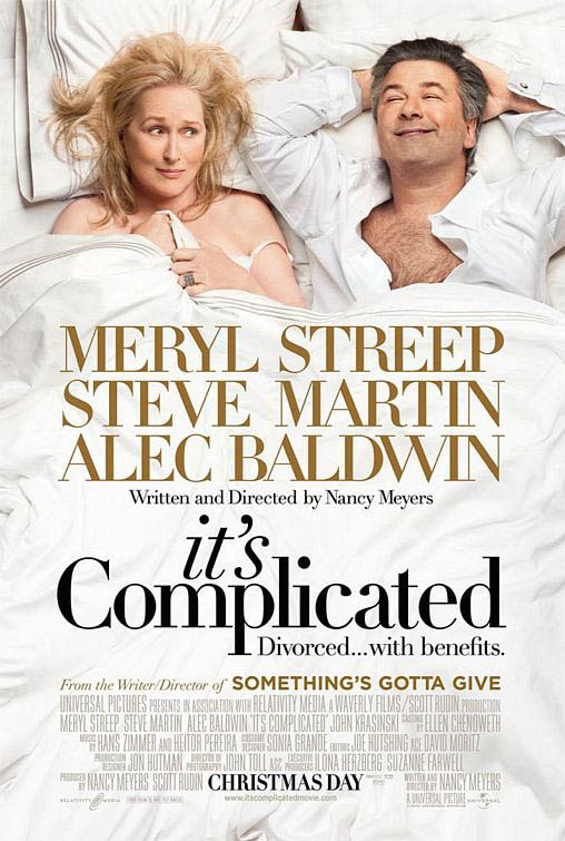 The film It's Complicated has a very large cast, but they haven't littered the poster with lots of pictures of the background actors and actresses, they have only put Meryl Streep and Alec Baldwin on the poster as they are the 2 most famous people in the film. They have also used a setting which gives away a bit of the storyline as well, which entices the audience to wonder whats going on and where the film is headed. This poster contains all of the common conventions that you would expect to see on a film poster: 1) Famous, well known actors on it, to make you think "Oh, I like Meryl Streep! Maybe I will go and see that!" 2) BOLD and LARGE names of the main characters that are and aren't on the poster to raise the question of the roles of them in the film "Oh Steve Martin, I like him, maybe I will go and see that!". 3) The title "It's Complicated" makes us question what the complicated relationship between Alec Baldwin, Meryl Streep and Steve Martin is, making the audience wonder and want to see it. The colours are also very light which combined with the expressions on their faces, it tells us that this is a light hearted film.
 These 3 posters are so different, not only are they different films they also attract their audience in completely different ways; although ultimatley the purpose of a film poster is to draw attention to the film and generate an interest in it, all of these posters do that!
No comments:
Post a Comment